Context
Bringing a 160 year old brand back to life
Equitable, formerly known as AXA Equitable Life (1991-2018) and the Equitable Life Insurance Company (1859-1991), became an independent US-based company in May 2018. With that came an opportunity to start a new chapter as an iconic American brand synonymous with helping generations of people achieve financial well-being.
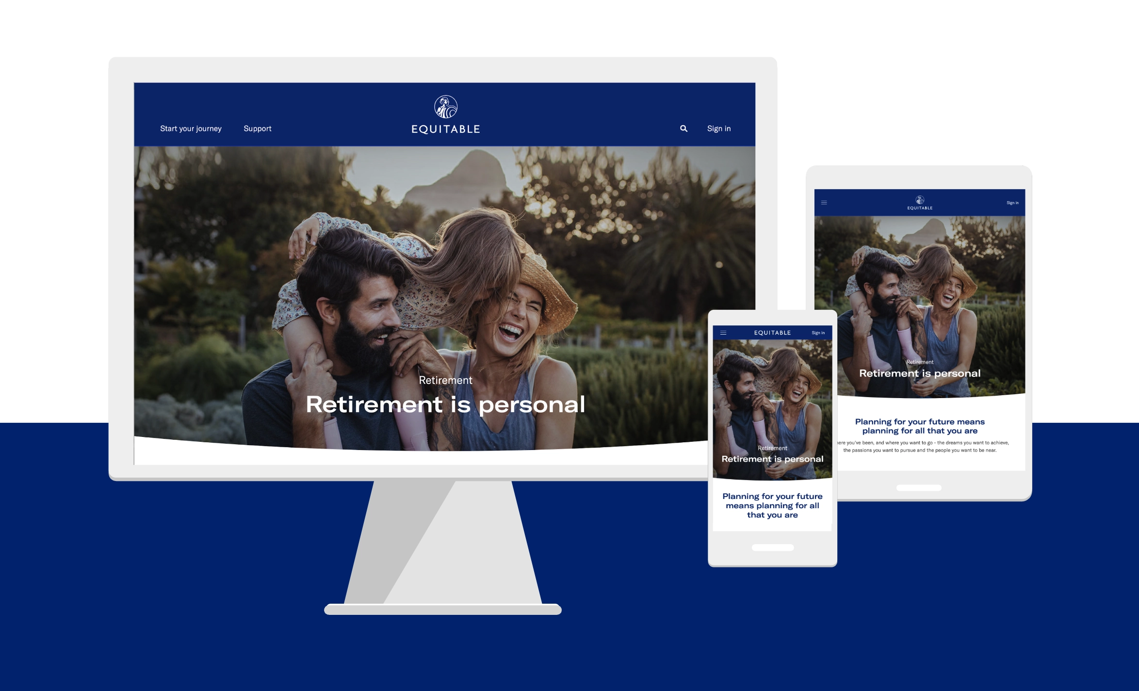
I was the lead UX and Visual Designer for Equitable.com and digital design system. A digital agency was hired to conduct interviews and competitive analysis.
Key Contributions
- Partnered with digital agency to analyze and translate findings into data visualizations, personas, user journeys and site maps.
- Collaborated with product owners to define the site features with balanced customer and business goals.
- Presented designs to executives and stakeholders throughout the project lifecycle.
- Created personas, journey maps, user flows, wireframes, prototypes and visual designs.
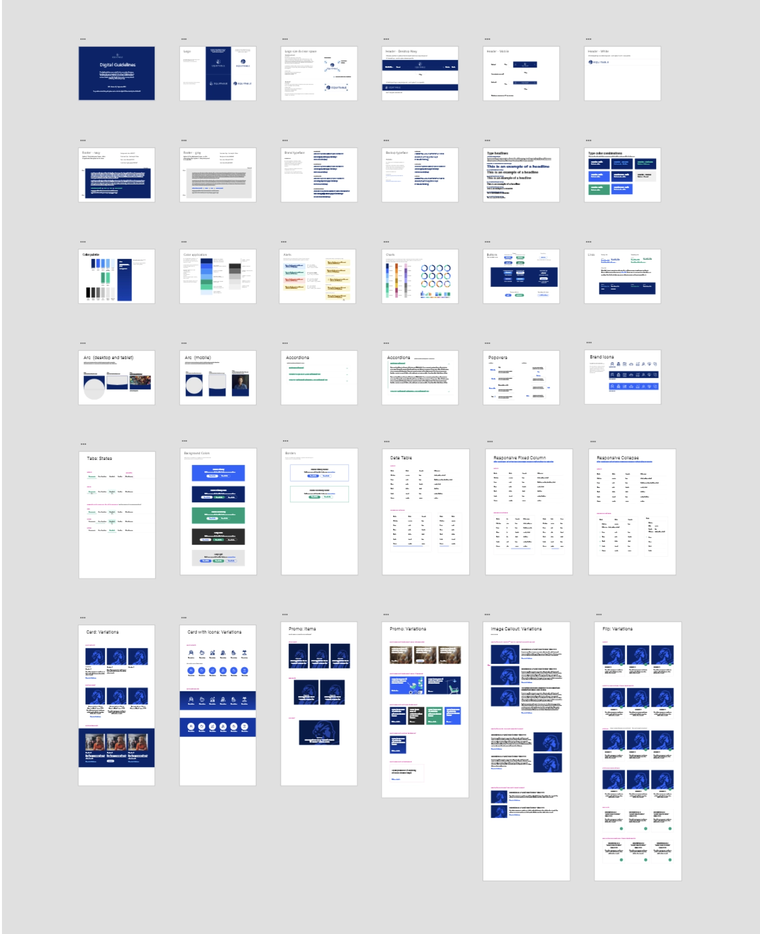
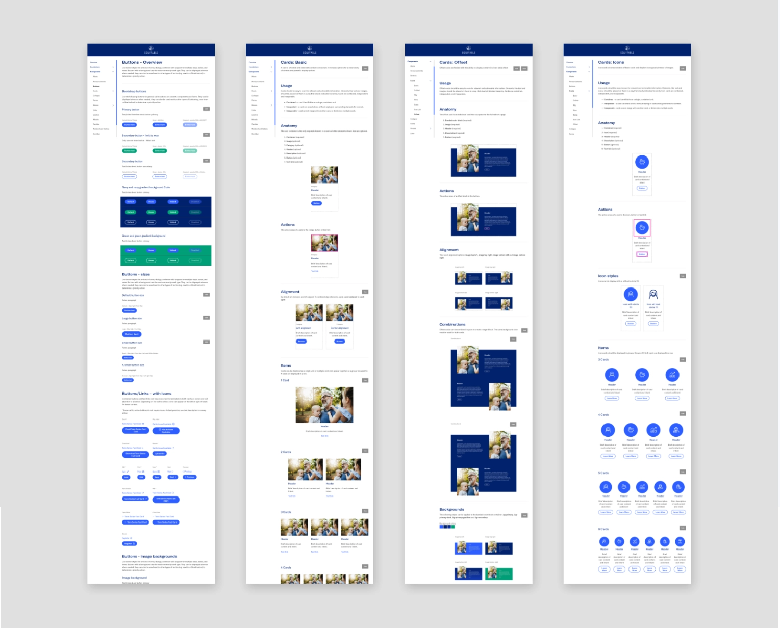
- Created component specifications & guidelines for digital design system.
- Create page template guidelines for the CMS (content management system)
- Created and executed usability tests on Usertesting.com.
- Coordinated tasks for 3 front-end developers in two week sprints.
Research & Insights
To start, we were guided with the following from the Equitable’s brand positioning:
- Commitments
Here for you — Evolving with you — Experts alongside you - Attributes
Strength — Courage — Wisdom
Competitive Analysis
A competitive analysis of key industry leaders was conducted focusing on design features that impact user experience. Most of the key findings confirmed what we already knew:
- None of our competitors are doing it well.
- All were product based
- Few humanistic touches
- Lack of UX focus
- Lack of personality & personalization
Interviews
The following interviews were conducted with the following groups:
- 9 key stakeholders were interviewed to gain a deeper understanding of the Customer (CX) visions, roadblocks, success metrics as well as project expectations and objectives.
- 3 current clients and 4 prospects were interviewed to gain a deeper understanding of their financial planning goals, including any interactions with financial advisors.
- 2 Equitable advisors were interviewed to gain a deeper understanding of their relationship with clients and prospects
Personas
Four personas were created to represent the different user types and to understand each user’s needs, experiences, behaviors and goals.
Journey Maps
A Journey map were created for each user to help visualize the different touch points from becoming aware of financial needs, researching products & services and seeking advice from financial professions. The journey maps also helped to gain insight into how each user experiences the new site based on their motivations and goals.

Challenges
AXA Equitable Life Insurance Company
Legacy can be an asset and at the same time a hindrance. Being a 160 year old company that has gone through two major ownership left the company in somewhat of an identity crisis. As part of the french-owned AXA Group, Equitable enjoyed international brand recognition that did not necessarily contribute to the company’s brand recognition in the US. In fact, in 2014, AXA trimmed off “Equitable Life” to increase the AXA awareness brand.
Main barriers:
- Lack of brand recognition
- New brand story was still in in development and not finalized
- Fragmented experiences (constellation of marketing apps, client & support sites)
- Product Silos
Opportunities
“…an opportunity to develop a new voice.”
The redesign was an opportunity to establish a fresh, innovative, and approachable tone, making financial planning more engaging and accessible. By modernizing the digital experience, Equitable can strengthen its reputation as a trusted, forward-thinking leader in retirement planning and financial services.
Design Approach
For this project we employed a mixture of design thinking and lean UX methodologies whenever possible. Site features and components were completed in 2 week sprints with designs typically completed at least one sprint ahead of development. I went through iterative cycles of analysis, reviews, approvals, detailed specs and handoff to developers.
I created prototypes in various stages to help with stakeholder alignment and user feedback, providing a clear vision of how the site would function and ensuring the design met user needs.
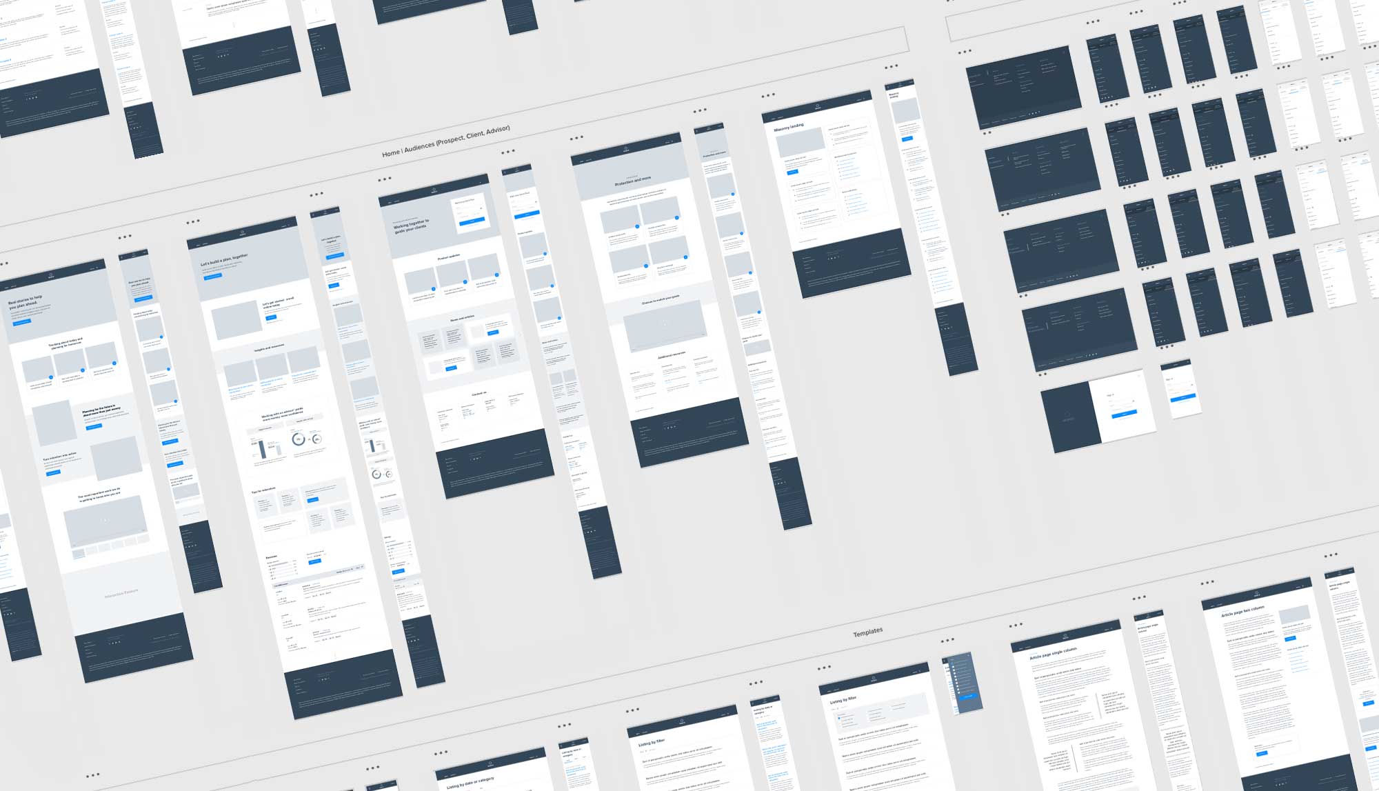
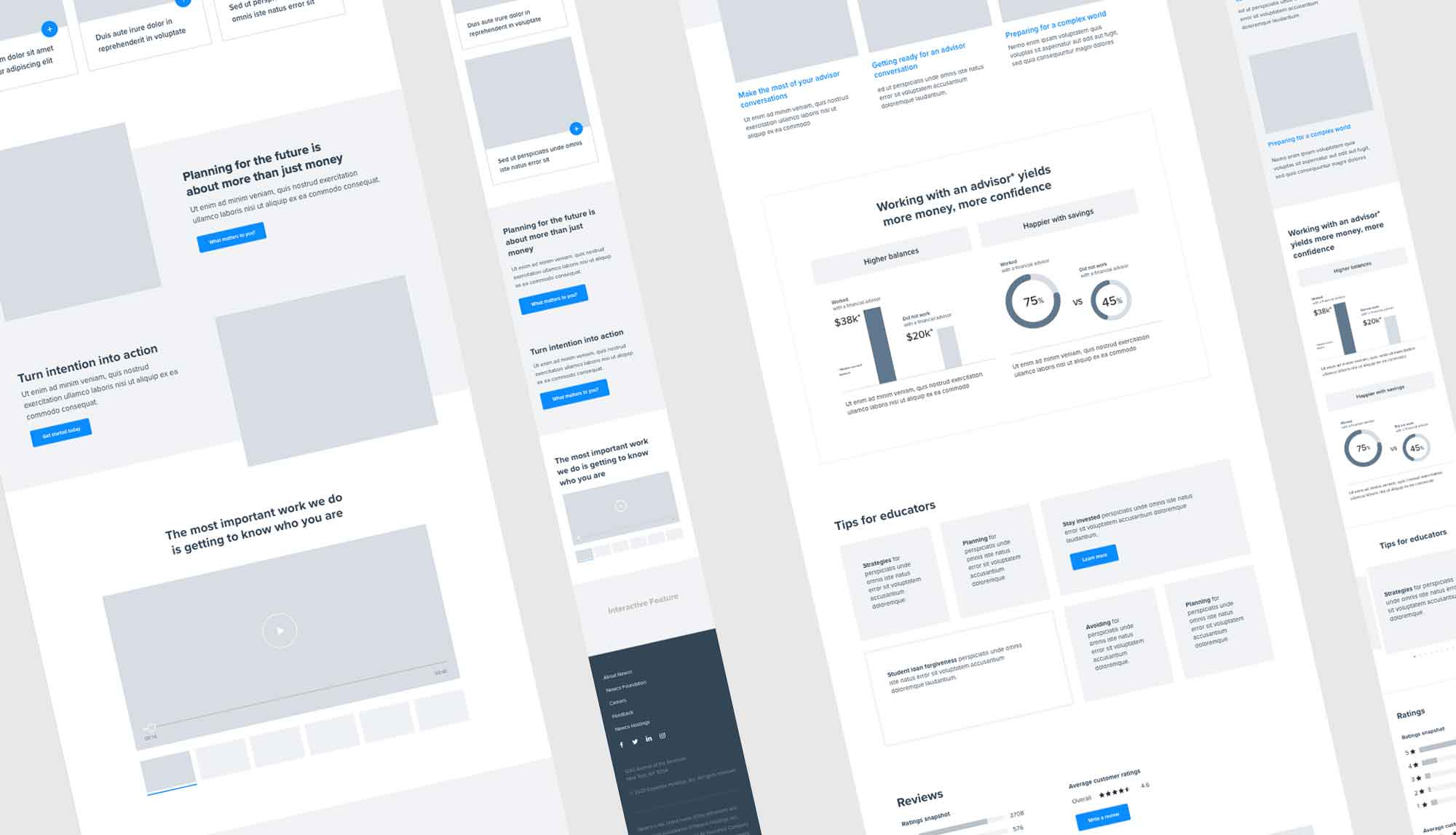
I created wireframes and high fidelity visual design comps for site features, page templates and components. Much of the detail specs was then used to create the digital design system (XD kit and online repository).
Reflections
Advocate, educate, repeat
Always prioritize the user, demonstrate value to stakeholders through action, and continuously reinforce the process.
A team within teams
With a non-negotiable launch date and multiple work streams in motion, collaboration across distributed teams was essential to align brand direction, stakeholder approvals, and technical development.
Don’t forget the users
Usability testing revealed navigation issues, but branding decisions overruled user recommendations, highlighting the ongoing challenge of balancing business goals with user needs.
Refinement, monitoring, and innovation
A website launch is just the beginning; continuous improvements are necessary to keep the experience relevant and effective


